Print proof · sample designs
Bold logos, brown paper, real food. See how a print lands before yours does.
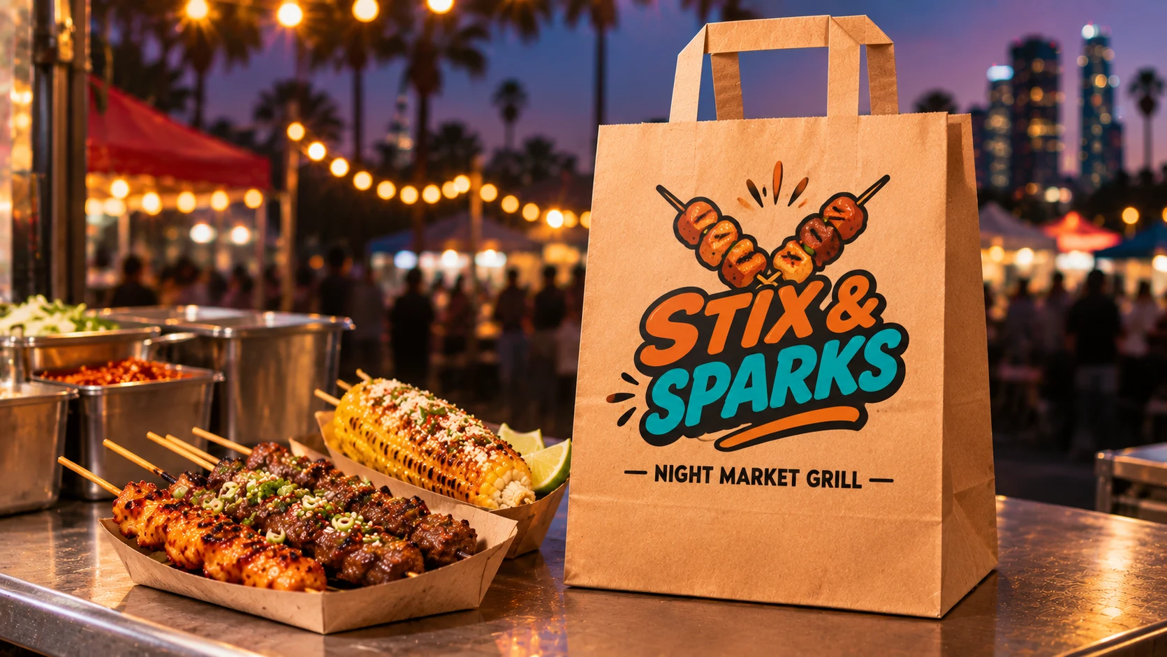
Every bag here is a sample design for a restaurant we made up. Study how loud colors, mascots and chunky letters sit on kraft, then picture your own name across that front panel.
Free toolNothing is uploaded
See your logo on the bag. Right now, free.
Pick your logo file and watch it land on our 12″ × 7″ × 14″ kraft bag, to scale, inside the 12 × 14 in print area. Your file stays on your device.
- Tip: a PNG with a clear background prints cleanest.
Setup is $0 and the front print is free. Want to test first? Try 50 bags for $28.
Free report cardOrange County logo check
Will your colors survive brown paper? Grade your logo in one second.
The samples here use loud colors and chunky letters for a reason. Pick your own logo file and see how it scores on brown kraft and bright white, whether any lines are too thin for paper, and how big it prints. No file handy? Type your shop name and grade a sample.
Your logo lands here
- On brown kraftContrast against the paper?
- On bright whiteContrast against the paper?
- Line weightThin lines at this size?
- Size on the bagPrinted width and height?
How we grade: contrast is the WCAG ratio between each main color and the paper, weighted by how much of the logo it covers (3:1 is the WCAG minimum for big text). Line weight looks for lines under about 2 mm at the size you pick, since kraft fibers soak up ink. The print area is 12 × 14 in on the front, and bags come in brown kraft and bright white. A guide, not a print proof. Your file never leaves your device.
Next free giftShrink your bag down to a delivery app tile and see if your name still reads, on the Little Saigon page→[01]Sample designs
Four pretend kitchens. Four ways a logo can work on kraft.
A clean seafood mark, a pizza slice on a scooter, a sushi roll in sneakers and a lumpia shouting into a megaphone. Different shapes, different color counts, and all of them read from across a counter.
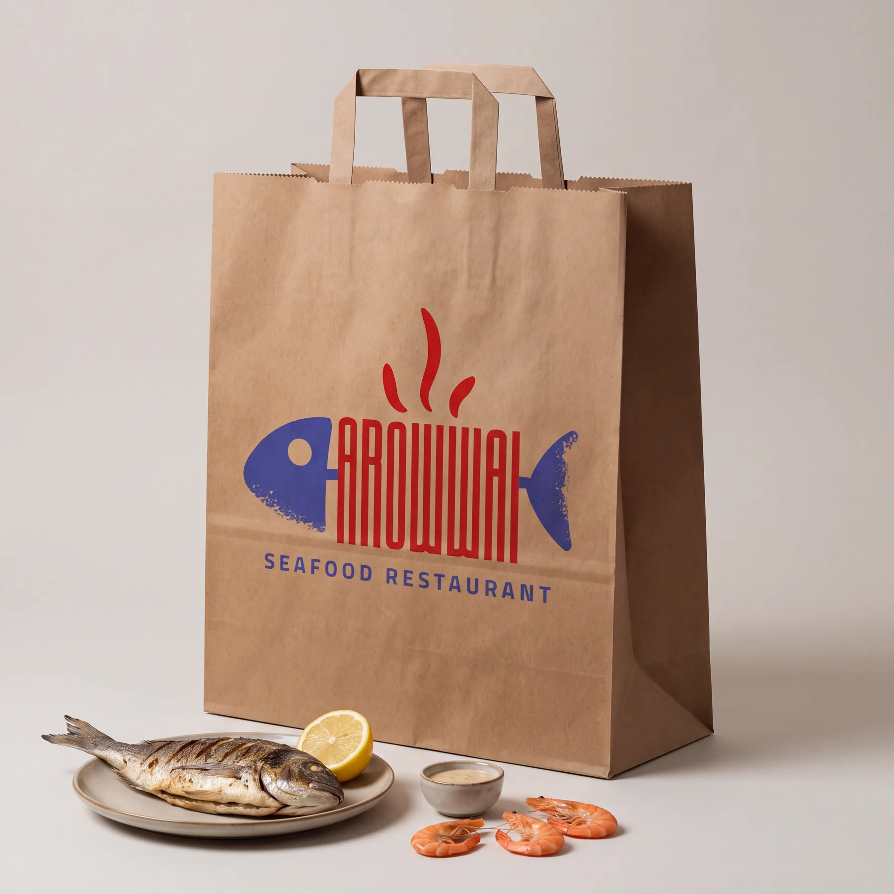
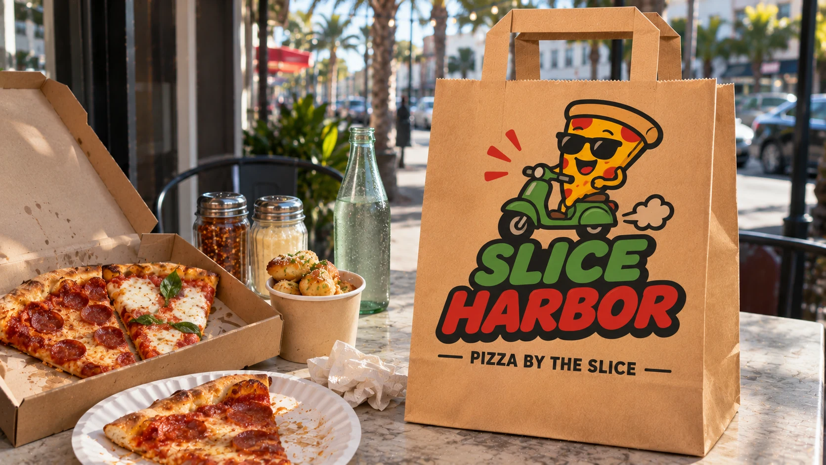
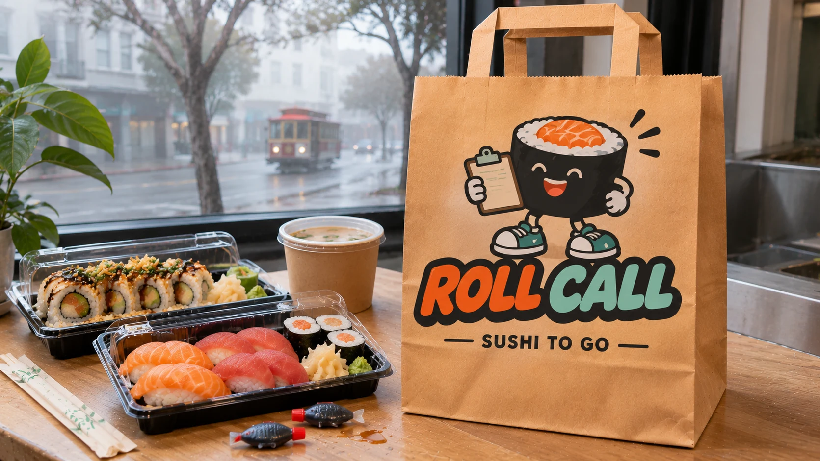
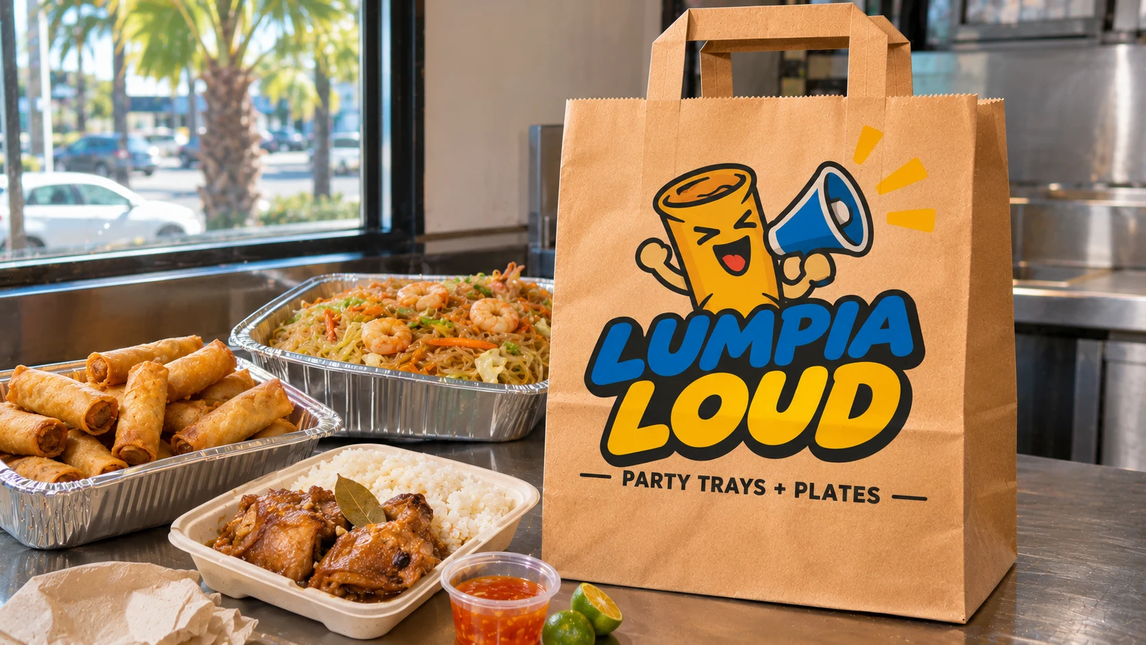
Every logo shown is a sample design, not a customer. Yours goes on in the upload step, where you see it on the bag before you pay.
[02]Print area
Edge to edge on the front. The exact space you get.
We print the front panel free. The side gussets stay plain so the bag still folds flat and pops open in one shake.
- Front print area
- Up to 12 × 14 in
- Bleed
- Full bleed, to every edge
- Printed free
- the front
- Back panel
- Optional, paid add-on
- Number of inks
- However many your logo uses
- Paper
- brown kraft and bright white
- Bag size
- 12″ × 7″ × 14″
Check your file in one minute
Pull up the logo you plan to use and walk through this list. Pass all five and it will print clean.
- Blow it up big. Zoom way in. Fuzzy or jagged edges mean the file is too small. Ask your designer for the original, or use a PNG at least 2000 pixels wide, a PDF or an SVG.
- Kill the white box. A logo saved on a white background prints a white rectangle on brown paper. Save it with a see through background.
- Step back from the screen. Hairline strokes and tiny taglines disappear first. If you can't read them from across the room, neither can a customer in the parking lot.
- Know your colors. Use as many as you like. Each one sits on the paper color, so brown paper warms them up and white paper keeps them true.
- Hold it next to a real bag. Put your phone beside any brown bag in the kitchen. If the logo still jumps out, you're done.
Two alphabets on one bag
Plenty of Orange County logos mix English with Vietnamese, Spanish, Arabic or Korean. Two scripts on one bag look great when each one gets room to breathe.
- Give the accents space. Vietnamese tone marks sit above and below the letters. At small sizes they can blur into the word, so keep that line a bit bigger.
- Match the weight. If the English name is heavy and the second line is thin, the thin line vanishes on kraft. Pick weights that look equal.
- Stack, don't squeeze. One language on top, one below, beats two names crammed onto one line.
Not sure how yours will look? You can see it on a bag in the logo tool at the top of this page before you spend a dollar.
Bright brands and brown paper
OC loves color: mango orange, sunset pink, ocean teal, lime green. Here's how those land on our two papers.
- Brown kraft makes black, navy, forest green and deep red look rich. Pastels and light yellows turn warmer and softer because the paper shows through.
- Bright white keeps colors close to what you see on screen. Pick it when your brand is neon, pastel or very light.
- One color logos look sharp on both and give brown kraft a clean, handmade feel.
Dark ink pops on brown. Light ink needs white.
You are the proof
The old way is a file sent, a proof back in a day or two, a change, another wait. Here the proof happens on your screen while you order. Your logo shows up on the bag, you drag it and size it, and you only pay when it looks the way you want.
Stuck on the file? Email it to hello@supplyaccess.co with a line about what you cook, and I'll tell you which paper I'd pick. Prices and sizes live on the Orange County printed takeout bags home page.
[03]Print questions
The little things that decide how a print looks.
Which file types can I upload?
A PNG with a see through background, a PDF or an SVG. For a PNG, aim for at least 2000 pixels wide.
Can my logo be in two languages?
Yes. We print exactly what you upload. Keep the smallest lettering bold so it reads from a few feet away.
Can you print a photo of my food?
Clean logos and bold lettering print best. Soft photo shading loses detail on kraft paper.
Is the back of the bag printed too?
The front is free. Printing the back is a paid add-on you can choose on the product page.
Your name next
Enough samples. Put your own logo on the front.
Upload your logo while you set up your box and you'll see it on the bag before checkout. Or start with the Kraft Discovery Box: 50 bags with your logo printed free.
Full box from$85